

A high-converting booking page does one job: turn intent into a confirmed booking with the least friction possible. Everything else is decoration.
If you're designing or briefing one right now, here's the shortlist to work from before you touch colour palettes or copywriting:
- Hero and headline that name the service and the outcome in under five seconds
- Live availability or a calendar visible without scrolling
- A simple, obvious product or service selector (no more than three choices at once)
- Pricing shown upfront, not revealed at checkout
- One clear call-to-action button, repeated, never competing with a second CTA
- A confirmation screen and automated reminder that closes the loop
Booking pages that follow a Z-pattern or F-pattern layout guide the eye from headline to calendar to CTA in the order people naturally scan a page. Design galleries full of booking page examples show the same pattern repeated: strong hero image, minimal form, one button that stands out. And the payoff for getting this right is measurable. Animal Booking's provider data shows that platforms built around automated reminders and simplified payment can cut missed appointments by up to 80% and lift revenue by around 30% per booking.
Key Takeaways
A booking page converts when it removes decisions rather than adding persuasion, and closes the loop with a clear confirmation and reminder.
| Point | Details |
|---|---|
| Lead with availability | Show the calendar or date picker above the fold when dates drive the purchase decision. |
| One CTA, repeated | Use a single, specific call-to-action button rather than competing buttons on the same screen. |
| Price before payment | Display pricing and deposit terms upfront, never hidden until the final checkout step. |
| Confirmation closes the loop | Automated reminders and a clear confirmation screen are what actually cut no-shows, not aesthetics. |
| Match layout to business type | Appointments need calendar-first flows; rentals and events need product or ticket selectors up top. |
Table of Contents
- Booking page design examples you can actually copy
- Why these layout patterns actually convert
- Which booking page layout suits your business type?
- The components every booking page template needs
- What should you A/B test on a booking page?
- Performance and accessibility basics developers shouldn't skip
- How do you create a shareable booking URL or embed a widget?
- What does better booking UX actually deliver?
- Common booking page questions answered with examples
- A step-by-step framework for launching your booking page
- Design mistakes that quietly kill booking conversions
- Integrating your booking page with existing platforms
- Our take: the industry over-designs and under-simplifies
- Frequently asked questions
- Sources
Booking page design examples you can actually copy
Good design is stolen shamelessly from things that already convert. Here are eight patterns worth studying, each solving a different friction point.
Date-first rental flow. The calendar sits above the fold, before any product description. Visitors pick their dates, then see only the inventory available for that window. Rental and inventory-based booking examples consistently lead with this pattern because availability, not product browsing, drives the purchase decision.
One-page service booking. Everything, service selector, calendar, customer form, and payment, lives on a single scroll with no page reloads. This suits appointment-based businesses (groomers, vets, trainers) where the customer already knows what they want and just needs a slot.
Product grid with live availability. Multiple services or rental items display as cards, each showing a "next available" tag. This works well when customers are comparing options before committing to a date.
Hero-led emotional booking. A large lifestyle image or short video opens the page before any form field appears. Visual storytelling like this increases perceived value, which softens the sticker shock when pricing appears later.
Deposit-first checkout. The page shows a small deposit amount rather than the full price, with the balance clearly noted as due later. This lowers the psychological barrier to clicking "book."
Multi-step wizard with progress bar. Used for events or packages with several decisions (ticket type, add-ons, attendee details). The progress bar reduces the anxiety of not knowing how many steps remain.
Sticky mobile CTA. On smaller screens, the booking button stays fixed at the bottom of the viewport regardless of scroll position, so the action is never more than a thumb-tap away.
Confirmation-as-relief screen. Immediately after payment, a calm, uncluttered confirmation page repeats the date, time, and what happens next. It's the most underrated screen on the entire flow.
Recurring layout choices across dozens of booking website designs confirm none of this is guesswork. The same five or six components get rearranged depending on the business model, not reinvented from scratch.
For implementation, you've got two real paths: embed a widget inline on an existing page, or build a dedicated full-page booking flow. Widgets are faster to ship and easier to theme with CSS variables; full pages give you more control over storytelling and upsells. If you're prototyping first, editable travel and booking templates on Figma or Canva's booking template library will get you to a clickable mock in an afternoon rather than a week.
Pro Tip: Screenshot three booking pages you personally like using as a customer, not as a designer. The ones you'd actually book through again usually share one trait: you never had to think about what to do next.
Why these layout patterns actually convert
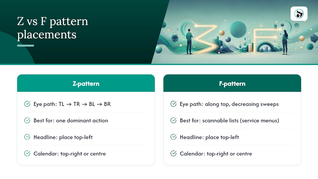
The Z-pattern and F-pattern aren't design trends, they're descriptions of how eyes move across a screen by default. A Z-pattern (top-left to top-right, diagonal down to bottom-left, across to bottom-right) suits pages with one dominant action. An F-pattern, where attention runs along the top then drops in decreasing horizontal sweeps, suits pages with scannable lists like service menus. Put your headline top-left, your calendar or availability signal top-right or centre, and your CTA where the scan naturally ends. That's the entire logic behind most high-converting booking layouts.
The bigger lever is friction reduction. Every extra form field is a chance for someone to abandon. Every additional decision, choosing a location before a date, selecting a staff member before a service, adds cognitive load that wasn't necessary. The best pages present the calendar as an early decision control, getting the date question out of the way first whenever dates actually drive the purchase. Ask for name, contact, and payment. Everything else can wait until after the booking exists.
Trust signals matter more on a booking page than almost anywhere else on a site, because money is about to change hands. Show the price before checkout. State the deposit and refund terms in plain language, not legal boilerplate. Confirm what happens next: an email, a text, a calendar invite.
Microcopy carries more weight than most designers give it credit for. "Book Now" converts differently to "Check Availability" depending on how ready the visitor is. Availability notices should say something specific: "3 spots left Saturday" beats "Limited availability." Error states should tell people exactly what to fix, not just that something's wrong.
Pro Tip: Swap a generic CTA like "Submit" for a specific one like "Confirm My Booking." Specific verbs that describe the actual outcome consistently outperform vague ones.
Which booking page layout suits your business type?
Not every booking flow should look the same, because the decision the customer is making changes shape depending on what you sell.
- Appointments (grooming, vet visits, training sessions): calendar-first layout, single time slot, minimal choices beyond service and staff member.
- Rentals (equipment, venues, gear): date-range picker up top, product variants and extras shown once dates are locked in.
- Events (classes, workshops, ticketed sessions): hero and description first, then a ticket-type chooser with capacity shown clearly.
- Packages and bundles: product grid with upsells surfaced after the core selection, not before.
The decision rule is simple: if there's only one real choice to make (a time slot), use a one-page flow. If there are several sequential decisions (dates, then variants, then extras, then attendee details), a multi-step checkout with a visible progress indicator keeps people from feeling lost.
The components every booking page template needs
A booking page is really just ten components in the right order. Here's the structure worth copying into your next wireframe.
| Component | Placement rationale |
|---|---|
| Hero + headline | Above the fold; names the service and outcome in one glance |
| Availability calendar | Immediately visible for date-driven purchases; reduces cognitive load early |
| Product or service selector | Directly below or beside the calendar; limit to three visible options |
| Price summary | Shown before any personal details are requested |
| Deposit/payment options | Clear split between deposit and full payment, stated plainly |
| Customer form | Name, contact, and only the fields genuinely needed to fulfil the booking |
| Trust footer | Refund policy, guarantees, business credentials in plain language |
| Booking CTA | One button, repeated at natural scroll breaks, never duplicated in competing colours |
| Confirmation message | Repeats date, time, and next steps immediately after payment |
| Reminder settings | Automated email/SMS reminder scheduled at booking, not as an afterthought |
For a sample flow: calendar first, service selector second (defaulting to the most popular option), price and deposit third, customer details fourth, payment fifth, confirmation last. Validate the date and service before showing the payment form, not after. If you're building out extras or add-ons at the customer-details stage, a partner guide on upselling pet accessories has useful framing on where upsell prompts convert versus where they annoy.
What should you A/B test on a booking page?
Guessing wastes traffic. Test these in order of expected impact:
- CTA text and colour — "Book Now" versus "Check Availability" versus "Confirm My Spot," tested against your current button colour.
- Calendar-first versus product-first — does showing dates before services change completion rate for your specific audience?
- Field count — remove one non-essential form field and measure the drop-off change.
- Scarcity messaging — does "3 spots left" outperform no scarcity cue, or does it read as manipulative for your brand?
- Deposit amount and framing — a smaller stated deposit sometimes lifts completions even when the total price is unchanged.
Track click-to-book rate, booking completion rate, average order value, and no-show rate as your core funnel metrics. Small sites need patience here: a test with fewer than a few hundred conversions per variant usually can't tell you anything reliable, so don't call a winner after a good weekend.
Session recordings and behavioural analytics tools will show you exactly where people hesitate or abandon, which matters more than any single metric in isolation. Run one test at a time on the same page. Overlapping experiments on the same flow make it impossible to know which change actually caused the result.
Performance and accessibility basics developers shouldn't skip
Hand this list to whoever builds the page:
- Lazy-load hero images and video; a booking page that takes four seconds to show a calendar loses people before they've made a decision.
- Limit third-party scripts, each one is a potential render-blocker on the exact page where speed matters most.
- Make date pickers keyboard-operable and properly labelled for screen readers, not just mouse-friendly.
- Confirmation flows need to announce success clearly to assistive technology, not just show a green tick.
- Serve the page over TLS, collect only the data you need to fulfil the booking, and state plainly how payment details are handled.
- If you're using an embedded widget, have an iframe fallback ready in case a content security policy blocks the primary embed.
How do you create a shareable booking URL or embed a widget?
- Generate a direct booking link from your platform's dashboard, most tools including Animal Booking's calendar features let you create one per service or staff member.
- Add query parameters to deep-link to a pre-selected service or date, so a marketing email can drop someone straight into the right slot.
- Pre-fill known customer fields (name, email) when linking from an existing customer record to cut form friction further.
- Choose your embed method: inline widgets sit permanently on a page and suit dedicated booking sections; popups suit a CTA button on a page that shouldn't navigate away.
Some embeddable widgets support full theming through CSS variables, matching your brand's fonts and colours without touching the underlying code. Others mount with a single script tag or iframe, which is the safest fallback if your CMS restricts custom scripts. Test iframe height on mobile specifically; a cut-off calendar is a common and completely avoidable failure.
What does better booking UX actually deliver?
The gains from fixing a clunky booking flow aren't theoretical. Animal Booking's provider data shows automated reminders and simplified payment flows can reduce missed appointments by up to 80% and increase revenue by roughly 30% per booking. Neither number comes from better graphic design alone, it comes from removing the two biggest leaks in a manual process: people forgetting appointments, and people abandoning a payment step that's more complicated than it needs to be.
A groomer running bookings through spreadsheets and text reminders loses appointments not because clients don't want the service, but because nobody closed the loop on confirmation. Automate that loop and the no-shows largely disappear.
For the full breakdown of features behind these outcomes, Animal Booking's provider page has the detail; treat the figures above as platform-reported outcomes rather than a guarantee for every business.
Common booking page questions answered with examples
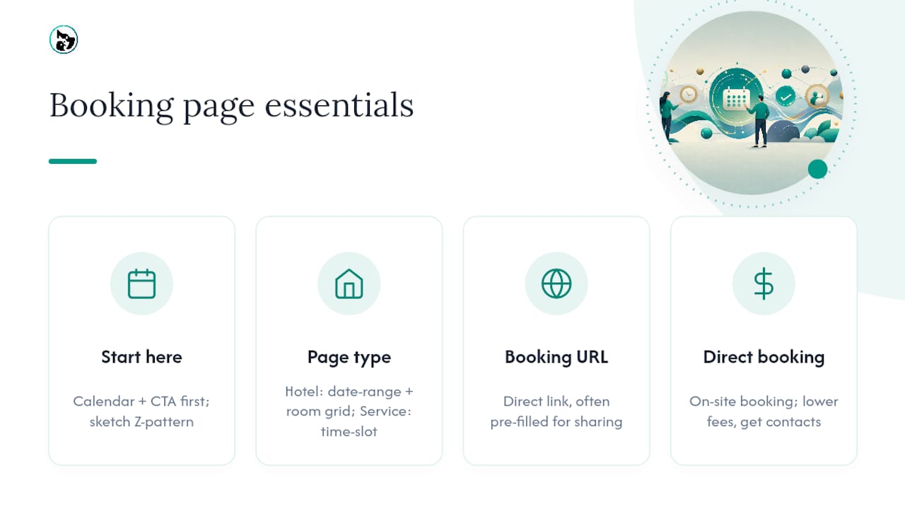
How do I design a booking page from scratch if I've never done one? Start with the calendar and CTA placement, then build backwards. Sketch the Z-pattern flow first: headline top-left, availability top-right, single CTA where the eye naturally lands last.
Does a hotel booking page need a different layout to a service booking page? Yes. Hotels typically need a date-range picker and room-type comparison grid, because customers are comparing options across a stay. A single-appointment service (like a grooming session) needs a simpler time-slot picker with no comparison step at all.
What's a booking URL and why does it matter? It's a direct link to your booking flow, sometimes pre-filled with a service or date, that you can drop into an email, an Instagram bio, or a Google Business listing without sending traffic through your full website first.
What does "direct booking" mean and why should I care? It means the customer books straight through your own page rather than a third-party marketplace. Direct booking usually costs you less per transaction and gives you the customer's contact details for future reminders and marketing, something a marketplace booking often doesn't.
A step-by-step framework for launching your booking page
Work through this order and you won't need to redesign halfway through:
- Define the one action. Decide what "booked" means for your business before wireframing anything.
- Map the minimum data you need. List only the fields required to fulfil the booking, cut everything else.
- Wireframe the Z-pattern flow. Headline, availability, selector, CTA, in that scanning order.
- Build the confirmation and reminder logic first, not last. It's the easiest piece to forget and the most damaging to skip.
- Prototype in Figma or Canva, test the flow with five real people before writing production code.
- Launch with one CTA variant, then start your first A/B test once you have baseline traffic.
Most businesses get this backwards, they polish the hero image for a week and launch with no confirmation email. Fix the order and the design work gets easier, not harder.
Design mistakes that quietly kill booking conversions
A handful of mistakes show up again and again on underperforming booking pages:
- Hiding the price until the final step, which reads as evasive even when it isn't intended that way.
- Running two CTAs of similar visual weight on the same screen, splitting attention that should go to one action.
- Asking for information you don't need yet (birthday, referral source) before the booking is even confirmed.
- Skipping the confirmation screen and relying on an email that might land in spam.
- Building a calendar that isn't touch-friendly on mobile, where most bookings now happen.
- Using vague microcopy like "Submit" instead of language that names the outcome.
Each of these is fixable in an afternoon. None of them require a redesign, just a second pass with a genuinely critical eye.
Integrating your booking page with existing platforms
If you're building on WordPress, Squarespace, or a custom site, the integration question usually comes down to iframe versus native embed. Iframes are the most reliable fallback across CMS platforms because they sandbox the booking experience from your site's theme, at the cost of slightly less design control. Native widgets that expose CSS variables give you tighter brand matching but need testing against your specific theme's stylesheet conflicts.
Whichever platform you're on, check three things before launch: does the embed resize correctly on mobile, does it load fast enough not to trigger layout shift, and does your content security policy allow the widget's domain. A five-minute test on a real phone catches most of these before a customer does.
Our take: the industry over-designs and under-simplifies
Most advice on booking page design obsesses over aesthetics, colour theory, font pairing, hero photography, while underweighting the two things that actually decide whether someone finishes booking: how many decisions you're asking them to make, and how quickly you close the loop after they pay.
The conventional wisdom treats booking pages like landing pages, optimised for persuasion. That's backwards. A visitor on a booking page has usually already decided to buy something; your job is to get out of their way, not convince them further. Every extra field, every unclear price, every missing confirmation message is a design failure dressed up as a minor detail.
If you take one thing from this: prioritise the confirmation and reminder flow before you touch the hero section. It's the least glamorous part of the build and the part that actually stops no-shows and protects revenue.
Frequently asked questions
What's the single most important element on a booking page? Availability. If the visitor can't quickly see when they can book, nothing else on the page matters.
Should I use a full booking page or an embedded widget? Use an embedded widget when you want the booking flow inside an existing page; use a dedicated page when the booking itself is the primary reason someone visits.
How many form fields should a booking page have? As few as fulfil the booking, typically name, contact detail, and payment. Anything else can be collected after confirmation.
Does mobile-friendly booking design really change conversion rates? Yes, most bookings now happen on mobile, and a calendar that's fiddly to tap on a small screen is one of the fastest ways to lose a booking mid-flow.
Ready to put this into practice without building the payment and reminder logic yourself? Animal Booking's pricing page outlines plans built specifically for pet service providers who'd rather launch a working booking page in minutes than build one from scratch.
Sources
- Z pattern vs F pattern — LandingPageFlow
- Booking websites - 21+ best booking web design ideas — 99designs
- Booking Page — Dribbble
- Travel website templates to edit & customise — Figma Community